In the world of tiny living, every inch counts, and that philosophy extends profoundly to the power of color. Far from being a mere aesthetic choice, the right color palette in a tiny house can dramatically influence mood, perception of space, and overall well-being. For those embarking on the exciting journey of designing their compact dream home, understanding how to strategically select and apply colors is paramount.
Table of Contents
This comprehensive guide delves into the art and science of tiny house color palettes, offering practical insights and inspiring mood boards to help you transform your small space into a sanctuary that feels both expansive and deeply personal. Whether you’re aiming for a serene retreat, a vibrant hub, or a cozy haven, mastering color is your secret weapon for maximizing comfort and style in minimalist living.
The visual impact of a tiny house interior is immediate and all-encompassing. Unlike larger homes where different rooms can boast distinct personalities, a tiny house often functions as a cohesive, open-plan environment, making a unified and thoughtful color scheme essential. This article will explore how specific color choices can manipulate light, create visual flow, and even enhance functionality, turning perceived limitations into design opportunities. We’ll move beyond basic paint swatches, diving into the creation of mood boards that integrate textures, materials, and accent pieces, providing a holistic vision for your tiny interior.
From calming neutrals that invite tranquility to bold accents that inject personality, we’ll equip you with the tools to curate a palette that not only reflects your style but also optimizes your living experience.
For the discerning tiny house enthusiast, particularly those seeking inspiration on platforms like Pinterest, the quest for the perfect color scheme is a visual journey. This guide is crafted to be your ultimate companion, offering curated palettes and actionable advice that resonates with the unique challenges and joys of tiny living. We understand that a tiny home is more than just a structure; it’s a reflection of your values, a canvas for your creativity, and a testament to intentional design.
By the end of this article, you’ll be empowered to confidently select colors that expand your space, uplift your spirit, and truly make your tiny house feel like a grand home. For further inspiration on optimizing your tiny space, explore our article on 14 Smart Hacks to Make Your Tiny House Feel More Spacious.
The Calming Neutral Palette: Serenity in Small Spaces
In the realm of tiny house design, a calming neutral palette stands as a timeless and universally appealing choice. Neutrals—think soft whites, warm beiges, gentle grays, and earthy tones—are not merely a lack of color; they are sophisticated hues that create an expansive, serene, and inviting atmosphere. In a compact living environment, these colors work magic by reflecting light, making spaces feel larger and airier, and providing a versatile backdrop for personal touches.
This palette is particularly effective for those seeking a tranquil retreat, a minimalist aesthetic, or a foundation that can be easily updated with accent colors and textures. The beauty of neutrals lies in their ability to evoke a sense of calm and order, crucial elements for well-being in a small home.
Elements of a Calming Neutral Palette
•Soft Whites and Off-Whites: These are the workhorses of a neutral palette, providing a clean, crisp base that maximizes natural light. They create an illusion of spaciousness and serve as a perfect canvas for other elements.
•Warm Beiges and Creams: Introducing warmth, these tones prevent a neutral space from feeling sterile. They can be found in natural wood finishes, linen fabrics, and subtle wall colors, adding a cozy and inviting feel.
•Gentle Grays: From light silver grays to warmer greiges (a blend of gray and beige), these provide depth and sophistication without overwhelming the space. They pair beautifully with both cool and warm accents.
•Earthy Tones: Subtle hints of muted greens, soft blues, or terracotta can be woven into a neutral scheme through plants, pottery, or textiles, grounding the space and connecting it to nature.
Mood Board: Calming Neutral Palette
To truly visualize the harmony of a calming neutral palette, consider the following mood board:
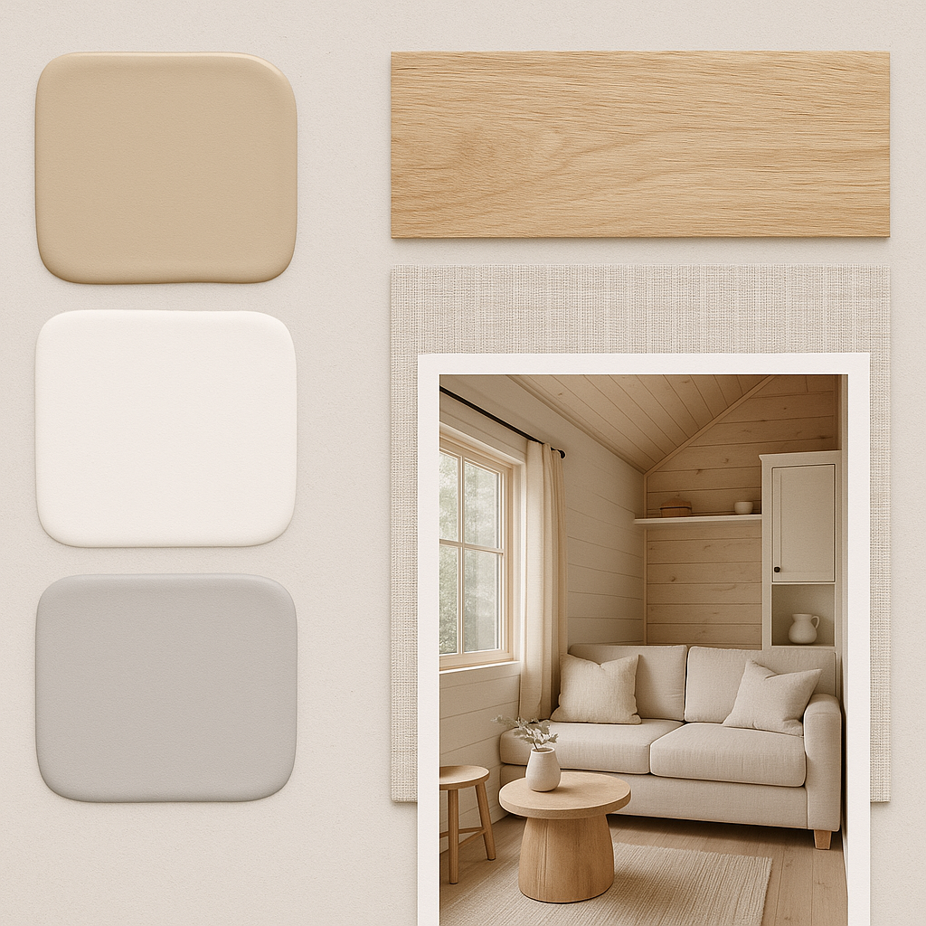
•Paint Swatches: Imagine walls painted in a soft, creamy white (like Benjamin Moore’s “White Dove”) or a light greige (like Sherwin-Williams’ “Agreeable Gray”). These foundational colors reflect light beautifully.
•Natural Wood Accents: Incorporate light-toned wood, such as birch, maple, or white oak, for flooring, countertops, or built-in shelving. The natural grain adds texture and warmth without introducing strong color.
•Linen and Cotton Fabrics: Choose textiles in natural fibers like linen, cotton, or wool for upholstery, curtains, and bedding. Their subtle textures and muted tones enhance the serene feel.
•Minimalist Decor: Opt for simple, clean-lined furniture and decor. Think ceramic vases, woven baskets, and understated artwork. A few well-placed green plants can add a touch of life.
Why This Palette Works for Tiny Homes
•Expansive Feel: Light colors recede, making walls appear further away and ceilings higher, effectively expanding the perceived size of the tiny house.
•Versatility: A neutral base allows for easy seasonal updates or changes in personal style through accessories, throw pillows, or artwork, without needing a complete overhaul.
•Timeless Appeal: Neutrals are classic and never go out of style, ensuring your tiny home remains fresh and appealing for years to come.
•Stress Reduction: The absence of jarring colors creates a peaceful environment, promoting relaxation and reducing visual clutter, which is vital in a small living space. For more on creating a relaxing tiny home, see our article on Tiny House Interior Design Trends 2025: Where Style Meets Functionality.
Bold Accent Walls: Injecting Personality and Depth
While neutrals offer serenity, bold accent walls provide an opportunity to inject personality, create visual interest, and define distinct zones within a tiny house. A strategically placed accent wall can draw the eye, add depth, and make a powerful design statement without overwhelming the entire space. This approach is perfect for those who crave a touch of drama, a pop of vibrant color, or a way to highlight a particular architectural feature or piece of furniture. The key to success with bold accents in a tiny home is thoughtful placement and careful color selection to ensure harmony rather than chaos.
Choosing Your Bold Accent Color
•Consider the Mood: What feeling do you want to evoke? Deep blues and greens can be calming and sophisticated, while vibrant yellows or oranges can be energetic and playful. Reds can add warmth and passion.
•Location, Location, Location: The best place for an accent wall is often a wall that naturally draws the eye, such as behind a bed, a main living area wall, or a wall with a unique feature like a built-in bookshelf. Avoid accenting walls with too many doors or windows.
•Balance with Neutrals: A bold accent wall works best when surrounded by a predominantly neutral palette. This allows the accent color to truly pop and prevents the space from feeling too busy or small.
•Test, Test, Test: Always test your chosen color with a large swatch on the wall before committing. Observe how the color changes throughout the day with different lighting conditions.
Mood Board: Bold Accent Walls
Here’s a mood board illustrating how a bold accent wall can transform a tiny space:
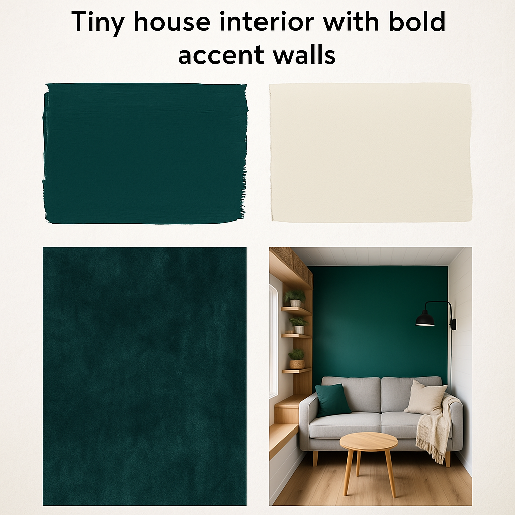
•Paint Swatches: Imagine a rich, deep teal or emerald green on one main wall, contrasted with crisp white or a very light gray on the remaining walls. This creates immediate visual impact.
•Textural Elements: Incorporate textures that complement the bold color, such as a velvet throw pillow in a similar hue, or a piece of dark wood furniture that grounds the space.
•Metallic Accents: Gold, brass, or copper accents can add a touch of luxury and sophistication, reflecting light and enhancing the richness of the bold color.
•Artwork and Decor: Choose artwork that either harmonizes with the accent color or provides a striking contrast. Keep other decor elements minimal to let the accent wall be the star.
Tips for Implementing Bold Accents in Tiny Homes
•Don’t Overdo It: Limit bold accents to one or, at most, two walls. Too many strong colors can make a tiny space feel cluttered and overwhelming.
•Consider Lighting: Darker, bolder colors can absorb light. Ensure your tiny house has ample natural and artificial lighting to compensate.
•Use as a Zone Divider: An accent wall can visually separate areas in an open-concept tiny home, such as defining the sleeping area from the living space.
•Extend to Accessories: Carry the accent color through to smaller accessories like throw pillows, blankets, or decorative objects to create a cohesive look.
The Coastal-Inspired Palette: Bringing the Outdoors In
For many tiny house dwellers, the allure of a minimalist lifestyle is often intertwined with a desire for a closer connection to nature. A coastal-inspired palette perfectly encapsulates this yearning, bringing the serene and refreshing ambiance of the seaside directly into your compact living space. This palette typically features a harmonious blend of blues, greens, sandy neutrals, and crisp whites, evoking the tranquility of ocean waves, the warmth of sun-drenched beaches, and the organic textures of driftwood and sea glass.
It’s an ideal choice for those who wish to create a light, airy, and calming interior that feels perpetually on vacation, regardless of their physical location. The coastal aesthetic, when applied thoughtfully to a tiny home, can make the space feel incredibly open and breathable, expanding its perceived boundaries.
Key Elements of a Coastal-Inspired Palette
•Oceanic Blues: From soft sky blues to deeper navy and turquoise, these hues are central to the coastal theme. They can be used on walls, textiles, or decorative accents to mimic the vastness of the sea.
•Seafoam Greens: Muted greens reminiscent of sea glass or gentle waves add a subtle, natural touch and pair beautifully with blues and neutrals.
•Sandy Neutrals: Warm beiges, creams, and light browns provide the grounding element, reflecting the colors of sand and natural wood. These are excellent choices for larger surfaces like flooring or main walls.
•Crisp Whites: Used for trim, ceilings, and often as a primary wall color, white enhances the airy feel and provides a clean contrast to the blues and greens.
•Natural Textures: Incorporate materials like wicker, rattan, jute, linen, and light-toned wood to add organic texture and reinforce the natural, beachy vibe.
Mood Board: Coastal-Inspired Palette
Visualize your tiny house transforming into a seaside retreat with this mood board:
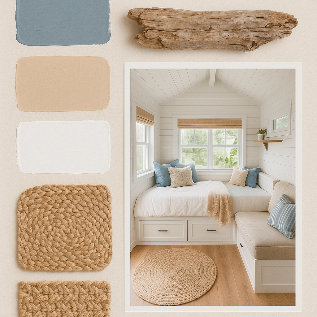
•Paint Swatches: Consider a light, muted blue (like Sherwin-Williams’ “Sea Salt”) for an accent wall or a soft, sandy beige for main walls, complemented by crisp white trim.
•Driftwood and Light Wood: Use light-colored wood for furniture, shelving, or decorative pieces. The weathered look of driftwood can be incorporated through art or small decorative items.
•Woven Fabrics: Jute rugs, linen curtains, and cotton throw pillows in shades of blue, white, and beige add texture and comfort.
•Glass Accents: Clear or colored glass (especially seafoam green or aqua) in vases or decorative bottles can mimic the look of sea glass and add a touch of sparkle.
•Minimalist Decor with Nautical Touches: Keep decor simple, but don’t shy away from subtle nautical elements like a rope knot, a framed piece of coral, or a simple shell display. Avoid overt or kitschy themes.
Why This Palette Excels in Tiny Homes
•Light and Airy Feel: The combination of light colors and natural textures creates an open, spacious, and breathable atmosphere, counteracting the confined feeling sometimes associated with tiny living.
•Sense of Calm: The blues and greens are inherently calming, promoting relaxation and reducing stress, making your tiny house a peaceful sanctuary.
•Connection to Nature: This palette seamlessly blends indoor and outdoor aesthetics, making your tiny home feel more connected to its surroundings, especially if you’re parked near water or natural landscapes.
•Versatile and Adaptable: While distinctly coastal, the palette is flexible enough to incorporate other elements, allowing for personalization without losing its core essence. For more on creating appealing living spaces, refer to our article on Tiny House Interior Design Trends 2025: Where Style Meets Functionality.
Maximizing Light and Space with Color: Optical Illusions in Tiny Homes
In a tiny house, where every square foot is precious, the strategic use of color can be a powerful tool to create optical illusions that make the space feel larger, brighter, and more inviting. It’s not just about painting walls white; it’s about understanding how different hues, tones, and finishes interact with light to manipulate perception. By carefully selecting and applying colors, you can visually expand cramped areas, heighten low ceilings, and even define distinct zones within an open-concept layout. This section will delve into the art of using color to maximize the sense of light and space, transforming your tiny home into a visually expansive and comfortable haven.
Techniques for Visual Expansion
•Light Colors on Walls and Ceilings: As previously discussed, light colors (whites, pastels, light grays) reflect more light, making walls appear to recede and ceilings feel higher. This is the most fundamental principle for expanding space.
•Monochromatic Schemes: Using variations of a single color throughout the space creates a seamless flow, preventing visual breaks that can make a tiny home feel chopped up. This continuity tricks the eye into perceiving a larger area.
•Cool Colors for Depth: Cool colors like blues, greens, and purples tend to recede visually, making a wall painted in one of these hues appear further away. This can be used to create a sense of depth in a narrow space.
•Warm Colors for Coziness (with caution): While warm colors (reds, oranges, yellows) tend to advance, making a space feel cozier, they can also make a tiny room feel smaller if overused. Use them sparingly as accents or on a single wall to create a focal point.
•Glossy Finishes: High-gloss paints reflect more light, adding a subtle sheen that can make a surface appear more expansive. Use them on trim, doors, or even a single accent wall for a touch of luminosity.
•Matching Wall and Trim Colors: Painting trim the same color as the walls eliminates visual breaks, creating a continuous surface that enhances the feeling of spaciousness.
•Strategic Use of Dark Colors: While counterintuitive, a very dark color on a single, far wall can create an illusion of depth, making the room feel longer. This works best in well-lit spaces.
•Color Blocking: Using blocks of color to define zones in an open layout can create visual interest and structure without the need for physical walls. For example, a different color on the wall behind the kitchen area can subtly separate it from the living space.
The Role of Lighting
Color and light are inextricably linked. The way a color appears can change dramatically depending on the type and amount of light it receives. In a tiny house, optimizing both natural and artificial lighting is crucial for making your chosen palette shine:
•Maximize Natural Light: Keep windows unobstructed, use sheer curtains or blinds, and consider skylights or larger windows during the design phase to flood the space with natural light.
•Layered Artificial Lighting: Combine ambient lighting (general illumination), task lighting (for specific activities like reading or cooking), and accent lighting (to highlight features). Dimmers allow for flexibility in mood and brightness.
•Color Temperature of Lights: Warm white lights (2700K-3000K) create a cozy, inviting atmosphere, while cool white lights (4000K-5000K) can make a space feel brighter and more modern. Choose lighting that complements your chosen color palette.
By understanding these principles, you can harness the power of color to create a tiny house interior that not only looks beautiful but also feels remarkably spacious and comfortable. For more insights into maximizing functionality in small spaces, you might find our article on Designing Your Dream Tiny House Office: A Comprehensive Guide to Maximizing Productivity in Small Spaces helpful.
The Rustic Charm Palette: Warmth and Authenticity
For those who dream of a tiny house that feels like a cozy cabin nestled in the woods, the rustic charm palette offers an inviting and authentic aesthetic. This color scheme celebrates natural materials, earthy tones, and a sense of handcrafted warmth, creating an interior that feels grounded and comforting. It’s a perfect choice for tiny homes located in natural settings or for anyone seeking to infuse their compact space with the timeless appeal of country living. The rustic palette emphasizes texture and organic elements, making the tiny house feel rich and lived-in, rather than sterile or overly modern.
Core Elements of a Rustic Charm Palette
•Earthy Browns and Tans: These form the foundation of the rustic palette, found in exposed wood beams, natural wood paneling, and leather accents. They bring a sense of stability and connection to the earth.
•Muted Greens and Olives: Reflecting foliage and natural landscapes, these greens add a touch of freshness and serenity. They can be incorporated through plants, textiles, or subtle paint colors.
•Deep Reds and Oranges: Used sparingly as accents, these colors can evoke the warmth of a crackling fire or the rich hues of autumn leaves, adding a cozy and inviting touch.
•Creamy Whites and Off-Whites: These provide a soft contrast to the darker, richer tones, preventing the space from feeling too heavy. They are ideal for ceilings, trim, or as a base for walls.
•Natural Stone and Metal Accents: Elements like river rock, slate, or aged copper and iron can add an authentic, rugged feel, reinforcing the rustic aesthetic.
Mood Board: Rustic Charm Palette
Imagine the comforting embrace of a rustic tiny home with this mood board:
•Wood Finishes: Prioritize natural, unpainted wood for walls, ceilings, and flooring. Reclaimed wood can add character and history. Consider a mix of light and dark wood tones for visual interest.
•Textured Fabrics: Wool blankets, chunky knit throws, faux fur rugs, and distressed leather upholstery add tactile warmth and depth. Plaid patterns can enhance the cabin feel.
•Earthy Pottery and Ceramics: Hand-thrown pottery, ceramic mugs, and rustic dinnerware in natural tones contribute to the authentic, lived-in feel.
•Wrought Iron or Black Metal Accents: Hardware, light fixtures, or decorative elements in matte black or wrought iron provide a strong, grounding contrast to the natural wood.
•Greenery: Abundant indoor plants, especially those with deep green foliage, bring life and a connection to the outdoors. Consider hanging plants or small potted trees.
Why This Palette is Perfect for Tiny Homes
•Cozy and Inviting: The warm tones and rich textures create an inherently cozy atmosphere, making a small space feel like a comforting embrace.
•Timeless Appeal: Rustic design elements are classic and enduring, ensuring your tiny home remains stylish and welcoming for years.
•Celebrates Natural Materials: This palette encourages the use of wood, stone, and natural fibers, aligning with sustainable living principles and creating a healthy indoor environment.
•Hides Wear and Tear: The natural, often distressed, look of rustic materials can be forgiving of minor imperfections, adding to the charm rather than detracting from it.
•Sense of Authenticity: For those seeking a genuine, unpretentious living space, the rustic charm palette delivers a feeling of authenticity and connection to traditional craftsmanship. For more ideas on personalizing your tiny space, check out our article on DIY Tiny House Projects: Personalize Your Small Space on a Budget.
The Modern Minimalist Palette: Sleek Simplicity
For those who appreciate clean lines, uncluttered spaces, and a sophisticated aesthetic, the modern minimalist palette offers a sleek and functional approach to tiny house design. This color scheme typically revolves around a restrained selection of colors—often whites, blacks, grays, and muted tones—paired with intentional pops of color or natural materials. The emphasis is on simplicity, functionality, and a sense of calm order. In a tiny home, this palette works exceptionally well by creating an illusion of spaciousness and promoting a clutter-free environment, which is essential for comfortable small-space living. It’s about achieving maximum impact with minimal elements, allowing the architecture and carefully chosen pieces to speak for themselves.
Characteristics of a Modern Minimalist Palette
•Crisp Whites and Off-Whites: These are the foundation, used extensively on walls, ceilings, and built-in cabinetry to create a bright, airy, and expansive feel. They serve as a neutral canvas.
•Varying Shades of Gray: From light silver to charcoal, grays add depth and sophistication without introducing strong color. They can be used for furniture, accent walls, or flooring.
•Bold Blacks: Used sparingly for contrast, black can define architectural elements, frame views, or add a touch of drama through fixtures, hardware, or furniture legs.
•Muted Tones: Subtle hints of muted blues, greens, or even soft blush can be introduced through textiles or artwork to add warmth and personality without disrupting the minimalist aesthetic.
•Natural Materials: Concrete, light-toned wood, and metal (like brushed steel or matte black) are frequently used to add texture and warmth, preventing the space from feeling too stark.
Mood Board: Modern Minimalist Palette
Envision a sleek and functional tiny home with this mood board:
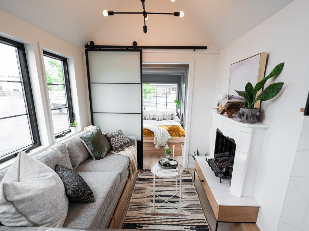
•White Walls and Ceilings: The primary background, creating a sense of openness and reflecting light.
•Light Wood Flooring: Adds warmth and a natural element, contrasting with the crisp white.
•Gray Upholstery: A sleek gray sofa or bench provides comfortable seating and a sophisticated touch.
•Black Accents: Matte black light fixtures, door handles, or a slim-profile frame for a mirror add definition and modern flair.
•Minimal Decor: Focus on quality over quantity. A single piece of abstract art, a sculptural plant, or a carefully chosen ceramic vase can be enough to complete the look.
•Integrated Storage: Seamless, handle-less cabinetry and built-in storage solutions are key to maintaining the uncluttered, minimalist aesthetic.
Why This Palette Thrives in Tiny Homes
•Maximizes Space: The light colors and lack of visual clutter make the tiny house feel significantly larger and more open.
•Promotes Order: A minimalist aesthetic naturally encourages tidiness and organization, which is crucial for comfortable tiny living.
•Timeless and Sophisticated: This palette offers a contemporary and enduring style that won’t quickly feel dated.
•Reduces Visual Noise: The simplicity of the color scheme creates a calm and serene environment, reducing sensory overload in a compact space.
•Versatile for Personalization: While minimalist, the neutral base allows for easy personalization through textures, plants, or a single bold piece of art, without compromising the overall aesthetic. For more on modern tiny house interiors, you can explore our article on Tiny House Interior Design Trends 2025: Where Style Meets Functionality.